A Grey-Day Window Check for Choosing Room Colours
A grey-day window check shows how paint samples shift across a room, helping you choose a shade that suits the daylight each wall actually receives.
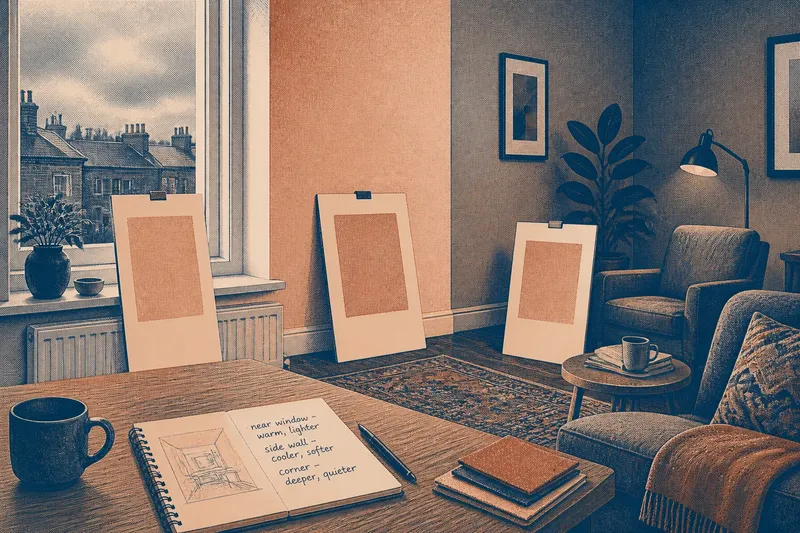
The common mistake with paint samples is judging them in one bright patch beside the window, then expecting the same color to work across the room. A grey-day window check makes that mismatch visible before you commit: compare the same samples near the glass, along a side wall, and in the dimmest area where the color will be seen.
Cloudy daylight is useful because it softens direct sun and makes differences between locations easier to notice. It does not reveal every condition a room will have, but it gives you a calm baseline for comparing how a shade responds to the light available in different parts of the space.
What is a grey-day window check?
A grey-day window check is a simple comparison of paint samples placed at several points in a room during overcast daylight. The samples should be the same color and finish, so the changing factor is their position, not the product.
Look for shifts in perceived warmth, brightness, and color cast. A pale gray may seem almost white near a window and noticeably blue farther away. A muted green may appear quieter in a shaded corner than it does beside the glass. Those differences are not faults; they are information about how the room’s daylight meets the color.
Use this check to decide whether you want one color to change character across the room or prefer a shade that remains fairly consistent in the places that matter most. It is not a promise that the paint will look identical at every hour or under every lamp.
How should I place paint samples around the room?
Use several large sample boards rather than judging tiny chips. White foam board or heavy, primed card gives you a surface you can move without painting the wall. Apply the sample paint in an even coat and let it dry according to the product directions; wet paint can look different from its finished surface.
Place matching boards in three useful locations:
- Near the window: Set one where daylight reaches the room, but avoid a narrow strip of direct glare.
- On a side wall: Choose a wall turned partly away from the window, where the light arrives at an angle.
- In the dimmest occupied area: Put a board near a reading chair, dining spot, or other place where you spend time.
Keep the boards upright and close to the wall plane. A board laid flat on a table catches light differently, while one held at an angle can reflect the window and exaggerate shine. If the room has two windows facing different directions, place a sample near each so that one opening does not stand in for the whole room.
What should I look for on an overcast day?
Start by comparing each sample with the neighboring wall and with fixed surfaces such as flooring, trim, or a large upholstered piece. Notice whether the color seems warmer, cooler, duller, or more saturated in each location. Then check whether the change is pleasant, distracting, or simply something you would not have noticed without looking carefully.
Do not ask only which board looks prettiest beside the window. Ask which location has the most influence on your everyday view. If the far wall forms the background to a sofa, its appearance may matter more than a brighter strip near the glass. If the color is intended for every wall, compare all the positions before deciding.
It can help to write a few plain observations beside a quick room sketch: “warm near window,” “cool behind table,” or “still soft in corner.” These notes keep the decision tied to visible differences rather than a vague impression that the color is simply right or wrong.
Why can the same paint sample look different across the room?
Daylight changes direction and strength as it enters a room. A wall facing the window may receive more direct light, while a side wall gets light reflected from other surfaces. A recess or far corner may receive little daylight at all. The paint is the same, but the light reaching your eye is not.
Surroundings also affect perception. A warm wood floor can make a nearby neutral seem cooler by contrast; a vivid rug may make a subdued wall color appear less saturated. Gloss and texture matter too: a smooth sample can reflect a bright window, while a matte finish tends to show less reflected glare. For a useful comparison, sample the finish you are considering and keep the boards in similar surroundings.
Cloud cover does not erase these differences. It reduces sharp sun patches, making the room easier to read as a set of light zones. Treat the grey-day check as one viewing condition, not as a substitute for noticing how the room changes later.
Should I check samples in artificial light too?
Yes, if you use the room after daylight fades. Once you have compared the samples in overcast daylight, leave them in place and view them under the lamps you normally use. A warm bulb can make some colors appear more golden; a cooler light may bring out a bluer cast. The effect depends on both the lamp and the paint.
Turn on the usual lights rather than adding a special bright lamp for the comparison. Check the sample where you sit or work, and notice whether the color still feels comfortable against nearby furnishings. If you use different lamps in different parts of the room, compare the samples under those separate pools of light as well.
It is not worth moving boards every few minutes to chase every fleeting change in the sky. That adds effort without making the choice more reliable. Instead, observe at a few ordinary moments: overcast daylight, the room’s usual daytime conditions, and evening light if you regularly occupy the space then.
How do I choose between a color that shifts and one that stays steady?
A color that shifts can give a room changing character: a muted blue might feel airy near the window and more intimate in a shaded corner. A steadier-looking color may be preferable if you want adjoining walls to read as a quiet background. Neither response is inherently better; the choice depends on which walls dominate your view and how much variation feels comfortable.
Imagine you are considering a soft clay color for a living room. On a grey afternoon, the board beside the window looks pale and peachy, while the board behind the sofa looks deeper and browner. If you like the warmer depth behind the sofa but find the window wall too pale, compare a slightly deeper clay sample in the same three locations. The expected observable result is a clearer sense of whether the room-wide shift suits you, not proof that either shade will look identical later.
Keep nearby materials in view while making that choice. A sample beside honey-colored wood may read differently from the same sample beside cool stone or white trim. You do not need to assemble every furnishing before comparing paint, but the large surfaces that will remain in the room are useful context.
How long should I leave samples up before deciding?
Leave the boards in their intended positions long enough to see them during the daylight and evening conditions that matter to you. There is no fixed waiting period that fits every room. A north-facing room, a room shaded by nearby buildings, and a room with a broad unobstructed window can all offer different viewing patterns.
Look at the boards from your usual seat and from the doorway, not only from close range. A color may feel calm when examined directly but draw too much attention across the room. If two options remain close, keep both in place and compare them side by side in the same light; memory is less dependable than a direct view.
What if the window check leaves me unsure?
First, separate uncertainty about the color from uncertainty about the room’s light. If the sample looks appealing in one area but uncomfortable in another, decide which area deserves priority. If it looks wrong everywhere, try a different color family rather than choosing a nearby shade solely because it is easier to compare.
Check that the samples are fully dry, similarly sized, and made with the same finish. A small paper chip, a glossy sample beside a matte one, or a board reflecting the window can make the comparison misleading. If you are comparing a manufacturer’s paint products, follow the label and manufacturer instructions for preparing and viewing samples.
The main search phrase, “grey-day window check for choosing room colours,” describes a useful decision aid rather than a special paint technique. It helps you see where daylight changes a sample’s character, then choose whether that variation belongs in the room you have.
Before buying paint for the full room, make your final comparison in the spots that will shape daily views: the wall across from the main seating area, the surface beside the window, and any shaded nook you use. A choice based on those actual locations is more informative than a judgment made from one bright corner alone.